
Every Click Matters: How UX Determines Whether Your Web3 Product Will Survive
Have you ever opened a website or mini-app and immediately found yourself wondering: “Okay… what am I supposed to do here?”
If yes — you’re in good company. Around 95% of users leave a page like that without ever figuring out its supposedly “intuitive” interface.
This happens far more often than it should. And in today’s digital reality — the era of short-form videos, instant dopamine hits, and constant convenience — users’ willingness to learn something new or wrestle with complex mechanics has dropped to nearly zero.
Below, we’ll break down how a Web3 product can adapt to these new rules of the game — and which mistakes you should avoid at all costs.
A Painful Start: Onboarding That Pushes Users Away Instead of Pulling Them In
One of the biggest UX challenges in Web3 today is the overwhelming complexity of the first steps. Before users even get to evaluate the value of your product, they’re already forced to deal with an entire checklist: wallet creation, seed phrases, technical confirmations, gas fees, and terminology that makes no sense to an average user. This is where most projects lose the majority of their audience.
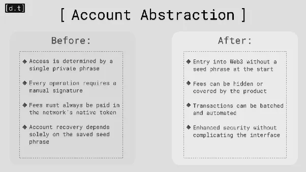
The Solution Is Right in Front of Us: Account Abstraction
This standard reshapes how users interact with decentralized products by turning a wallet into a programmable smart account. The technical burden fades into the background: users can sign in with familiar methods (email, social accounts), pay fees in a transparent way, and perform actions in a single click.
Everything that previously required multiple confirmations and a deep understanding of blockchain mechanics becomes simple — and therefore accessible to the mainstream.
Tools bringing this to life:
-
Privy: lets users access dApps without seed phrases, using email or social logins.
-
Web3Auth: supports Google, Apple, and social sign-ins while simplifying account recovery.
-
Safe: provides a smart wallet with multisig and social recovery options, making transactions safer and more predictable.
The Overloaded Interface: When Too Many Features Become the Main Problem
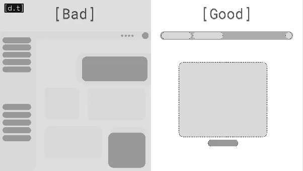
A flood of buttons, pop-ups, and crypto jargon is almost a guaranteed sign of poor UX. If you dump a thousand features and a wall of banners on someone the moment they enter the app, don’t expect gratitude. Most users will simply close the tab, confused and frustrated.
This issue is especially common among centralized exchanges, which over the years have grown into feature-packed monsters. One look at the Bybit homepage says it all.
The Fix: A Simple, Predictable Design
Strip the main screen down to what truly matters. Cut the banners, remove the overload of offers, hide the advanced tools.
You can reveal all the bells and whistles later — once the user understands the basics and is ready to explore deeper functionality.
Doubts About Safety: The Silent UX Killer
The very first question a user asks themselves is: “Can I trust this product?”
In the blockchain space — where scams, rug pulls, and shady mechanics are far too common — this question becomes critical. Unclear fee structures, vague transaction steps, and lack of transparency immediately trigger suspicion.
The situation gets even worse when:
-
personal data is requested without explanation,
-
users are forced to connect a wallet upfront,
-
information about the team, investors, or project origins is nonexistent.
These red flags lead to churn long before a user even interacts with the core product.
The Remedy: Build a UX That Feels Trustworthy
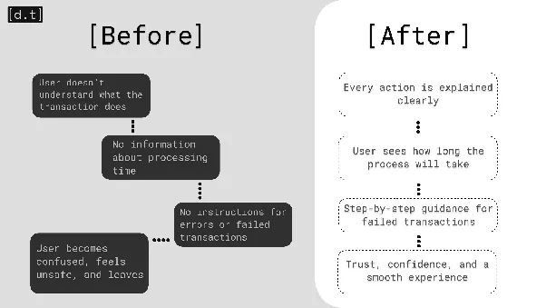
Your interface should guide users and explain every step clearly:
-
What exactly the transaction is doing.
-
How long it will take and what stage it’s currently in.
-
Why the fee exists and how it’s calculated.
-
What to do if something fails.
-
Whether an action can be accelerated or canceled.
If you can — let users cancel operations, even at minor cost to you (like when funds are accidentally sent). If you can’t, warn them before they confirm.
Offer tips. Remind users to check the network. Alert them if the selected token is incorrect. Don’t leave people alone with cryptic mechanics — especially when their money is involved.
Tell them who you are. Show investors, achievements, the team, or even share development progress. Every detail boosts trust and reduces the fear of interacting with your product.
Conclusion
Don’t force people to become experts from the first click. Guide them step-by-step. Explain briefly and at the right moment. Save the tedious parts for later. Let users settle in before tossing complexity their way.
Too many projects still repeat the same mistakes: overloaded interfaces, intimidating logic, and experiences that scare off the very audience they hope to grow.
The trend is clear: in 2025, the winners aren’t the most advanced projects — but the most understandable ones. Web3 users live in a world of instant decisions, and if your product can’t explain itself within the first minute, it risks remaining nothing more than a clever idea buried somewhere deep in the blockchain.
Attention is the new currency. Spend it wisely — and your users will give it back.
Prepared by the Dzeta.tech team. Graphics and text: Nikita A.